When you open a book, you often just read it. But as pointless as it may sound, words, paragraphs, and the page layout were carefully edited to improve your comprehension. What seems like small details play a huge role in the reader’s experience.
Why Health Literacy Matters in Medical Booklets
There is a particular challenge when it comes to health publications, health education materials, and patient information leaflets. One key aspect is ensuring they follow principles of health literacy, which is the ability to understand and use health information to make informed decisions. Imagine you are preparing for a medical procedure you don’t fully understand. You receive a medical booklet that explains what will happen before, during, and after the procedure, along with clear recommendations for your recovery. The text avoids complex jargon and presents medical concepts in a simple, accessible way, following principles of accessible health communication.
As you read the booklet, you gradually understand what to expect, remember the key details, and feel more confident, prepared, and in control of your own care.
To help you retain the most important information, we combine clear, plain-language writing with strategies that promote optimal information retention.
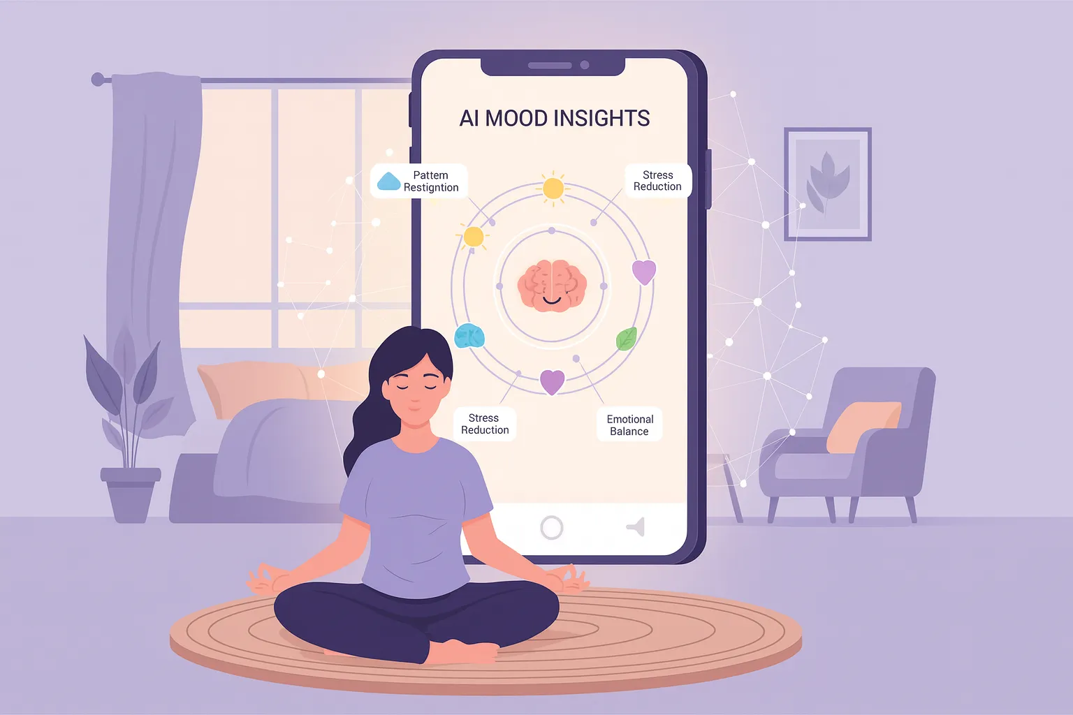
How Illustrations Improve Patient Understanding
Illustrations play a huge part in this. Text and images must work flawlessly together. At Precare, we produce illustrations that are reviewed and approved by our team of medical experts. We make a conscious effort to keep all representations of bodies gender-neutral, culturally inclusive, and diverse. When placing illustrations in the layout, our graphic designers ensure the visual elements directly support and visually reinforce the written information
It’s all carefully planned, so the patient won’t forget what they should avoid before surgery, for example. Designing a publication in this way makes it easier to remember some important things, like refraining from eating certain foods (for example, high-fat or high-fiber foods) a few hours prior to a hospital visit. A patient is more likely to retain information when they have seen an image that clearly represents the recommendation.

Design Rules for Accessible Health Publications
Another specific and rather interesting fact about working with health communication materials is that we often adapt or even break some standard rules of editorial design to improve comprehension and usability:
- We do not hyphenate a text.
- We always keep numbers close to their unit or complement (e.g., “38.5º” and “C” will never appear on separate lines).
- We align all text to the left and place illustrations on the right or at the bottom of the page
- We often repeat headers or titles that extend across multiple pages to make it easier to navigate. These serve as “shortcuts” to help readers quickly locate the section they need.
Accessibility and Inclusive Design
For accessibility, we use larger font sizes than what is common in traditional editorial design. A standard paperback book might have a font size of 9 – 10 pt. In our booklets, we work with at least 12 pt so patients with reduced vision can comfortably read the content.
We also adapt layouts to target a specific age group to promote engagement and self-identification. Designing booklets for children is very different from designing for adults. For children, we use different page sizes for easier handling, larger fonts, between 14 and 16 pt, and a style that feels approachable, even for those with basic literacy skills.

Patient-Centered Information Design
Considering the realities of the target group is essential to provide the best possible patient-centered materials. At Precare, we believe that clear, accessible information is a powerful tool to strengthen understanding between patients and healthcare providers. Our mission is to make every medical booklet a practical, easy-to-read, and visually engaging resource.
So, whenever you read one of our health booklets, know that we’ve poured our care, expertise, and design knowledge into making sure your experience is as clear, engaging, and helpful as possible. Click Here to explore our digital medical booklets and see how thoughtful design can make medical information easier to understand.
If your healthcare organization needs tailored patient education materials, contact Precare to learn how we can collaborate.