
When creating an educational healthcare video for patients, the most common question is: “How can I make it good?”
But what if we started with: “What would make this video bad?”
This is the idea behind inverted thinking — a problem-solving technique used by investor Charlie Munger and mathematician Carl Jacobi. Instead of aiming straight for perfection in health communication, we begin by identifying what doesn’t work. Avoiding obvious mistakes is often easier — and more practical — than defining what “perfect” looks like.
In patient education videos, this approach helps spot what might confuse, bore, or alienate the viewer. A poorly designed video might have rushed explanations, bad audio, disorganized scripting, or overwhelming visuals. By recognizing these issues, we create a clear list of what not to do — which, in turn, helps us produce clear, engaging, and effective health content.
This method is especially helpful for beginners in healthcare video production, as it reduces the pressure to “get everything right” from the start. Avoiding basic mistakes already improves overall quality significantly.
Here are some classic mistakes in medical video production that can make your content confusing or ineffective:
1. Make your videos too long
Long videos tend to feel exhausting — even with good content. You can’t assume the patient will stay just because they need the information. Competing notifications and social media are just a tap away.
📌 Better approach: Break content into short, focused videos that respect the viewer’s attention span.
2. Overuse flashy visuals
Distracting transitions, loud sounds, unnecessary animations, and cluttered backgrounds may harm more than help — especially when dealing with sensitive health information.
📌 Better approach: Keep visuals simple and supportive. Let the core message stand out without distraction.
3. Speak too fast (or too slow)
Fast speech makes it hard to follow. Slow pacing can bore viewers. The same applies to image transitions.
📌 Better approach: Maintain a steady, balanced rhythm that supports comprehension.
4. Use tiny or unreadable fonts
If the text is hard to read — especially on a smartphone — patients might give up.
📌 Better approach: Design with mobile in mind. Use clear fonts, strong contrast, and thoughtful layout.
5. Skip the introduction and context
Starting without explaining the topic can leave patients confused. Their first question is: “What will I learn? Is this worth my time?”
📌 Better approach: Briefly introduce the topic and clarify the value for the viewer.
6. Use too much text and too few visuals
If everything is written out, nothing stands out. It becomes a flat monologue.
📌 Better approach: Highlight keywords and show rather than just tell, whenever possible.
7. Deliver the content as one big chunk
No breaks or clear sections? That’s a fast track to viewer fatigue.
📌 Better approach: Think of your video like a book — with chapters, sections, and breathing room.
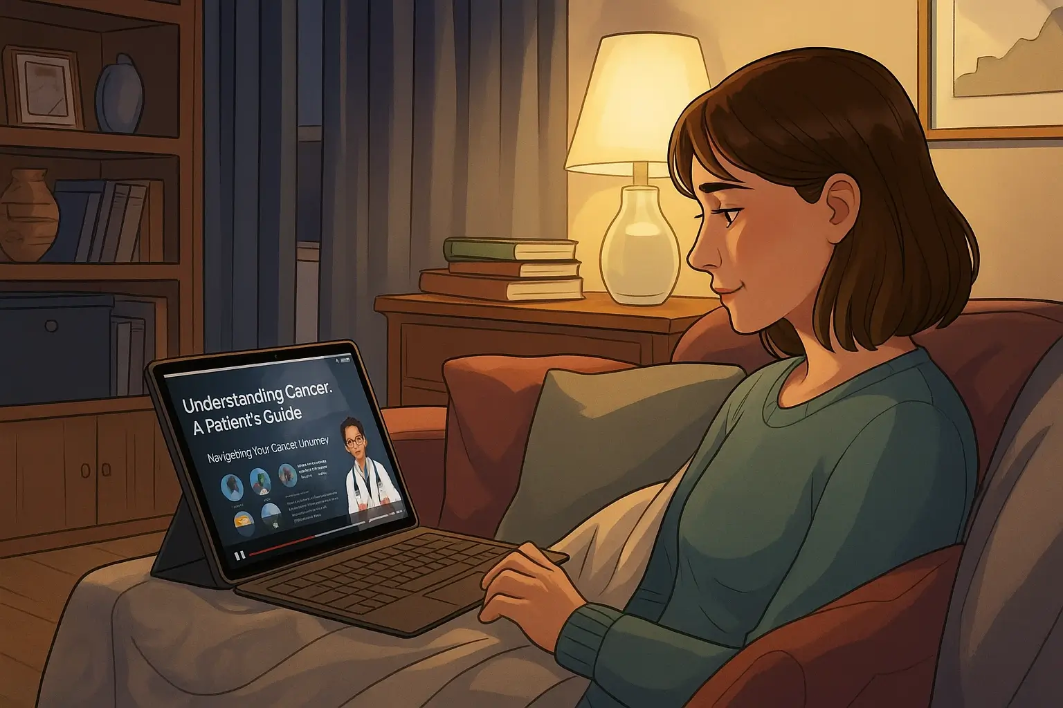
Real-Life Example: What a Well-Designed Health Video Looks Like
Want to see these principles in action?
Check out this Precare video on surgical gynecology
It’s a great example of how clear explanations, thoughtful pacing, and clean visuals can turn a complex medical procedure into something patients can actually understand and feel confident about.
This is what happens when you don’t fall into the common traps we listed above.


